
10/9/22 The REAB consortium has found its own style, and its website got own design
The approved logo of our consortium carries a very clear and frank meaning — in the future, most of the world and the market will belong to those unions, alliances, associations, participants for which we work. How big — you can see right on the logo.
At the same time, it is distinguished by simplicity and rigor — these are signs of a real style.
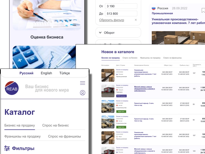
The design of our site will be sustained in the same spirit. We do not need to fool visitors with pathos and faceless words, bore them with the help of long-bored photos from business photobanks. Everything will be simple, convenient, strict and to the point. Fast, convenient, understandable. Nothing unnecessary.
The consortium itself will work in the same style.
Tags:
 Telegram
 VK.com
 Facebook
 X (Twitter)
 LinkedIn
 REAB Services
Initial business valuation
Business analysis and audit (Due Diligence)
Business pre-sale preparation
Initial assessment of the business being purchased
Audit of the purchased business (Due Diligence)
Company Registration — General Provisions

 News
News
 Useful tip
Each country has its own laws and rules for investors and business buyers. How to get around all the obstacles? Read related articles “Investor Life Hacks”.

